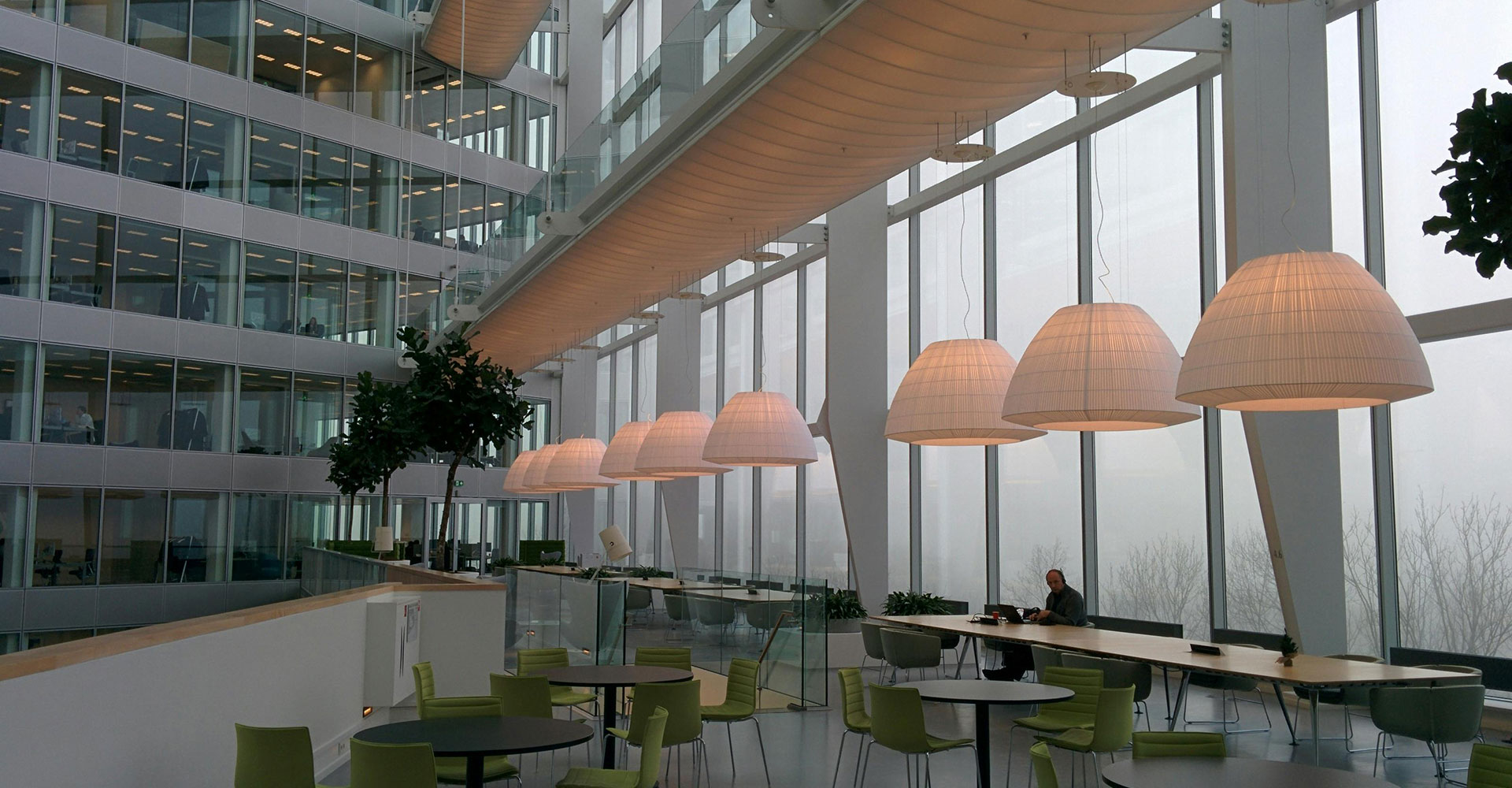
People spend many hours each week in offices or other work-related environments. And these environments play a crucial role in employees’ overall well-being. One significant factor and influencer of mood, emotions and behavior? Color. It’s a powerful communication tool that affects the body and mind.
Color psychology is the study of analyzing how colors influence people. It explores colors’ influence on emotional responses and how different factors like cultural background and age also influence our responses to color. Researchers have studied a range of topics including color’s impact on physiological responses, influence on behavior, and effect on mental health.
Another topic of study? How interior designers and building planners can use color to improve safety, designing more human-friendly and supportive home and work environments.
Research has shown that different colors trigger different reactions in the brain. Bland, boring colors — white, gray, beige, taupe — can negatively impact a mental state and even cause depression. Women often favor brighter colors whereas oranges and purples make men feel more depressed and melancholy.
Psychological Effects of Warm Colors
Associated with energy, excitement, and warmth, warm colors include the reds, oranges, and yellows of the color spectrum. They affect people in many ways, including:
- Increasing energy levels. Warm colors can stimulate the brain, increasing alertness and focus. In fact red stimulates adrenaline production, which can increase energy levels and heart rates.
- Encouraging action. Marketing and advertising often uses warm colors to promote products and services — think fast food and sports equipment — because this palette supports a call to action (CTA) to make a purchase.
- Promoting emotional expression. We associate red with passion and love — and orange with enthusiasm and excitement.
Psychological Effects of Cool Colors
Associated with calmness, relaxation, and tranquility, cool colors include the blues, greens, and purples of the color spectrum. Like warm colors, cool colors also have psychological effects:
- Creating a sense of calm. Interior designers often use these colors to create serene, peaceful atmospheres in homes, healthcare settings, and offices.
- Reducing stress and anxiety. Blues often evoke feelings of wisdom, hope and reason, while greens evoke nature, growth, and freshness. A 2020 survey studying emotional associations of over 4,500 participants found, for example, that 39% linked green to contentment and 35% associated blue with relief.
- Improving focus and concentration. Office spaces often use cool colors to promote concentration and productivity.
Speaking of Productivity…
Much has been discussed about the fate of office spaces in a post-pandemic world. Will people return to the office full-time or on a hybrid basis? Or will more businesses opt for an entirely remote workforce?
An oft-cited reason why people prefer to work from home is because they have the power to dictate and control their environment, including their home workspaces. Many say they’re more productive at home than in the office.
But companies that believe having their employees work in office — even on a hybrid basis — can take steps to create a welcoming, person-friendly environment through color. And understanding how the color palette works across different industries and settings can inform the color choices these companies make.
Want to increase efficiency? Choose blue.
Many experts nominate blue as the ultimate color for promoting wellbeing and productivity in the workplace. A Lund University study found painting spaces blue benefits employees working in demanding, fast-paced jobs. This harmonious color relieves stress and helps brains focus, which enables people to complete their jobs more efficiently.
Blue also stimulates the mind — so spaces where people engage in very technical or intellectually demanding work benefit from blue. Another benefit of this color? It’s generally pretty popular among both men and women. But blue has many different shades, including those which feel cold and unwelcoming.
Planning to go blue in your office? Paint a variety of swatches on your walls and take note of how the color changes throughout the day and in natural and artificial lighting.
Want to support the creatives in your office? Choose yellow — or purple.
Environmental psychologist and wellbeing consultant, Lee Chambers, calls yellow the color of creativity. He says, “An interesting feature of yellow backgrounds is that they increase information retention, which is helpful for highlighting key learnings and important information. If you have a creative job, yellow is definitely a solid choice.”
Industries reliant on collaboration and idea exchange should incorporate yellow into their color schemes. Entrepreneurs and innovators also gravitate toward yellow for its ability to inspire and generate optimism. But Chambers advises caution with this brilliant color: “Be mindful of the overuse of yellow as a background and as a space, as it does induce eye fatigue.”
Planning to incorporate yellow in your office? Opt for pops of color here and there, and start with a variety of swatches to choose the best shade that dazzles without overwhelming.
Purple is another great choice for inspiring confidence and mental awareness — while also promoting artistic ability, intuition, and creativity. These characteristics are useful to marketing and design teams who must make many decisions each day. Some people also associate purple with ambition, which serves as another creativity, efficiency, and focus-booster.
An entirely purple office might not be the best approach to incorporating this color — but purple artwork, rugs, or furniture provides the perfect pop of color, also contributing to the sophistication your office may want to convey.
Want to stimulate? Choose red.
Associated with power and excitement, a splash of red (as opposed to working in what feels like a ketchup bottle) works well for capturing attention and energizing employees. Fast-paced or physically demanding work environments often lead to elevated heart rates and blood flows — as does the color red. A University of British Columbia study also found that red boosts performance on tasks requiring attention to detail — programming and coding or proofreading, for example.
Used judiciously, red has many benefits. But like purple, think in smaller color pops or combinations with another color, like blue, to increase and support productivity. A red accent wall, chair rail, detailing along a wall or in a carpet might works well.
Want to increase or maintain productivity? Choose orange.
Orange invites activity, endurance, and enthusiasm into the workspace, boosting employee efficiency and productivity. Because it combines red and yellow, orange can also elevate mood. To help employees stay engaged and focused, add a little orange — but it’s another color best used in small, intentional ways: a throw pillow on an office chair, a detail in the carpet or in an accent wall, a piece of artwork, or in plants and flowers.
Adding color to an office environment boosts creativity, mental wellbeing, and productivity. Whether you’re covering plain white walls with an inviting blue or green, or adding unexpected sprinkles of brighter colors through accessories, think of the office as a blank canvas waiting for a palette of possibility.
Are you a commercial real estate investor or looking for a specific property to meet your company’s needs? We invite you to talk to the professionals at CREA United: an organization of CRE professionals from 92 firms representing all disciplines within the CRE industry, from brokers to subcontractors, financial services to security systems, interior designers to architects, movers to IT, and more.

